
I started by looking at mid-century home brochures.
So I went directly to the source, paint companies. And boy did they provide.
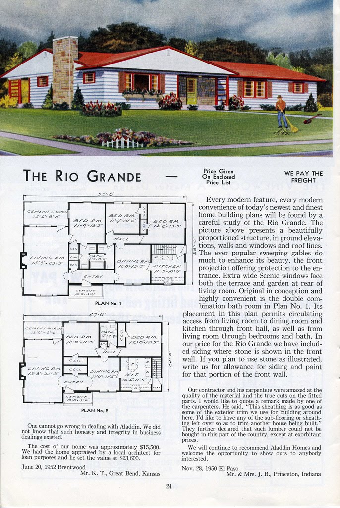
California Paints has some fantastic colors and insights into mid-century paint colors. Their mid-century modern color palette spans popular colors from 1940 to 1960.
The post-World War II housing boom and the popularization of modern architecture brought bold colors in deep tones into popularity once again. Earth tones dominated exteriors, while interiors featured sophisticated, modulated neutral shades like bone, gray-beige, pearl gray and taupe alongside saturated accents in fuchsia, teal, evergreen, charcoal and chocolate with strong contrasts in chartreuse, tangerine, gold and sulfur yellow.While this is the period I'm looking for, the main color on my mid-century ranch is white so earth tones and neutrals isn't really the exterior color I'm looking for as an accent. Although the Teal Accent might be an option.
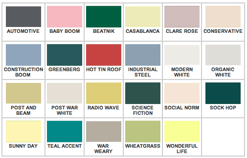
California Paints' Post Modern paint palette is probably closer to what I'm looking for.
Strong contrasts characterize the colors of the Post Modern/Cold War era: pale neutrals and pastel tints, used both inside and outside the home contrast with bright, clear accent colors. Deep shades of gold, yellow-green, red-orange or red-brown and bright blue, mint green and turquoise provide bursts of color in houses painted in warm beige, tan, avocado, peach or cinnamon tones.Bright blue, turquoise or mint green are exactly what I had in mind for an exterior accent color.
Sherman Williams has a Retro Revival line of paints that's intended for the mid-century home. But they were too pastel for me.

What’s old has circled back again! Retro Revival, features contemporary colors organized into a primarily mid-century sensibility. Part art deco, part 50’s suburban, part 60’s mod, these awesome retro colors are fresh and re-freshed for today’s tastes and styles. Know what’s so great about using classic colors with a new twist? These colors are familiar. We have seen them before in others ways, but re-purposed for modern day, they take on an entirely new light. Are your ready for your own Retro Revival?
Anna Sova's mid-century modern color collection that have a lot of great color options that pop.

Post-war American pleasures, from 1945 to 1960, VJ Day to JFK. The fabulous fifties brought hedonistic consumerism balanced with a beatnik poet's austerity. A passion for anything modern, new technologies and materials helped create biomorphic, abstract and expressionistic designs that were sleek, elegant and functional. Mid-century colors available in high fidelity for plywood blondes with swivel hips.
Then I went outside the box a bit and found the original Eames fiberglass colors (hat tip to Eames Office).

I think we're on the right path with our color selections and once we have our big stack of color chips down to one or two, I'll be sure to share.
Wonderful research!!!
ReplyDelete