
The inspiration is, "A re-birth of midcentury modernism is simmering in the Southwest" and people like A. Quincy Jones, Donald Wexler and Joseph Eichler all get name checked. And there's the required hat tip to Mad Men as well.
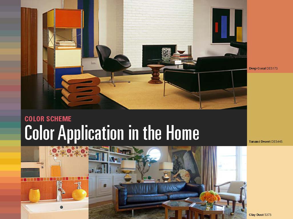
Once you get past the philosphy you can dive into the actual mid-century modern color palette, which "showcases a sense of play that pervades the historical senses of the Bauhaus to Mid-century to Memphis."
First there's, the full set of the 2013 mid-century modern house colors

Then an smaller interior mid-century color palette
And a few mid-century modern home exterior paint colors

They're all pretty standard as far a mid-century house colors go, muted tones as a base, in this case mainly earth tones, with a nice big pop of color as a highlight. My favorite combination – white and gray with a pop of blue – even makes an appearance in the mid-century color palette on the first page.
What brand and color name of white paint did you use on the exterior of your house? I am looking for a white for my ranch but there are so many I am getting confused.
ReplyDeleteGreat blog. Thanks for any info you can provide.
Gerry
We didn't do the original painting of the white, but we used Behr Ultra Pure White to do touch ups and it matches so perfectly that if I had to guess that's what it is. It's a pretty straight-forward white, it looks clean and works well with any other color/shade.
Delete