Mid-Century Paint Matching
If your spouse/significant other isn't a graphic designer, you might not know the name Pantone. And even if they are, you might be surprised to find out that Pantone has a line of paints.
For those who don't know Pantone, they are, in their own words, "the world-renowned authority on color and provider of color systems and leading technology for the selection and accurate communication of color across a variety of industries. The Pantone name is known worldwide as the standard language for color communication from designer to manufacturer to retailer to customer."
In understandable terms, they're a color matching system, a dictionary for colors. When people say "purple" they can mean all sorts of shades, but if someone says Pantone purple, they mean this:
And if they say Pantone 253 they mean this:
It's a very slight shade shift, but when you're telling a printer across town or a manufacturer in Japan what color something should be, there's no question if you're using Pantone.
So why is this important to mid-century paint colors? For a few reasons:
1) If you have a Pantone book, you can pretty easily match any unknown paint color in your home. Which is great news for those of us with a Pantone book and a house that has walls that were last painted in the 1950s.
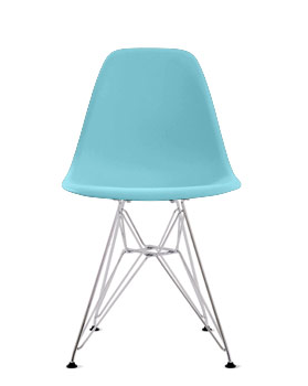
2) Say you want to paint your wall the exact shade of aqua sky as your Eames molded plastic chair.
Well, because Pantone does plastic colors too, aqua sky is also known as Pantone 14-4811
Purchase that shade of Pantone paint and you'll have a perfect match.
You can match all your mid-century paint colors here, on the Pantone paint color selector.
Subscribe to:
Post Comments (Atom)


Great post. My daughter is a web designer, so I take the Pantone books for granted. This is very useful information for people who aren't familiar with Pantone.
ReplyDelete